Colors are a big part of the art world—actually it would not be wrong to say that colors are a big part of our world on the whole. In fact, the world of food and fashion would be bereft if the world of colors did not provide so much liveliness to them. Which is why it is very important to study the way colors can be mixed to get the right shade. In fact, colors are not that complicated but the subtle shades and nuances are something that is required to be mastered if an artist wants to be able to create the magic he or she wants to on any surface. Whether you wanting to learn about pastel colored arts or do something else, it is important to master the use of colors and learning to mix them right so that effect is not spoiled.
PRACTICALLY USEFUL COLOR MIXING CHARTS

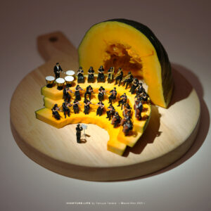
Any artist who wants mastery over his or her chosen field would make an effort to learn about colors and the impact they have on art so that they can create the kind of effect they want. Whether colors are subtle or blatant like in colorful and cheerful Caribbean art to cheer you up, colors are all important and one needs to get the whole thing down pat.
Here are simple tips and guidelines to help you mix colors in a practical manner:
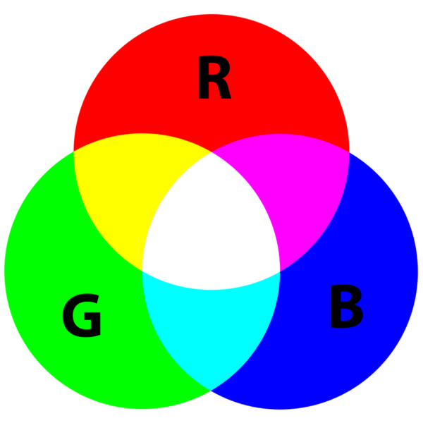
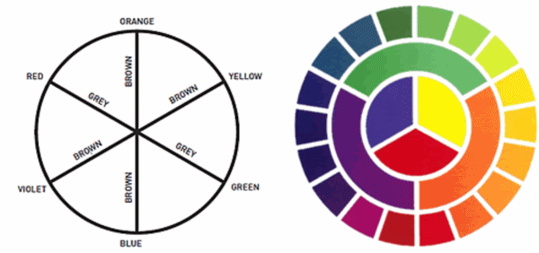
Know your primary colors: The first step to knowing how to mix colors is by knowing your primary colors. Red, yellow, blue are the primary colors but for the sake of learning how to mix them well, we are also going to include black and white here.
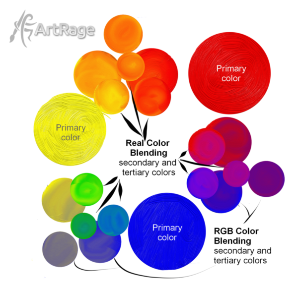
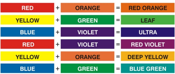
Mix them right: Now that we have established the colors or hues that are the primary ones, we should move on to find out what other colors we can derive from them. For instance, when you mix two primary colors, the resulting color is called a secondary color.
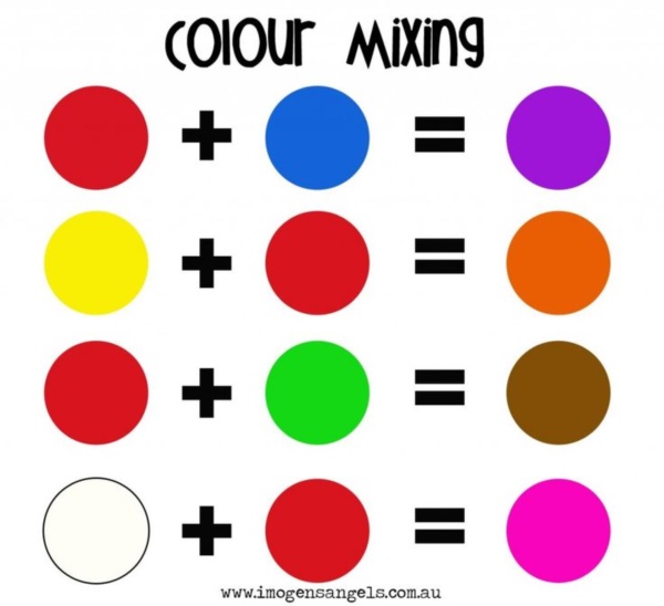
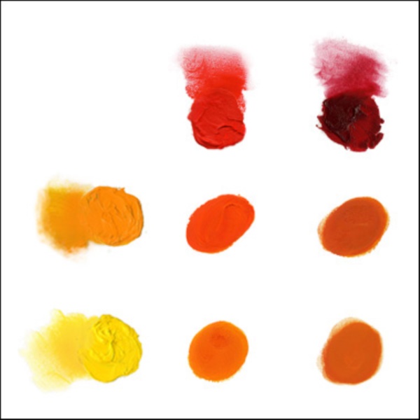
Orange: You get orange when you mix the two primary colors, red and yellow.
Violet: You get violet when you mix the two primary colors, red and blue.
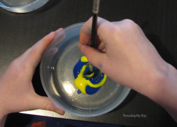
Green: You get green when you mix the two primary colors, blue and yellow.
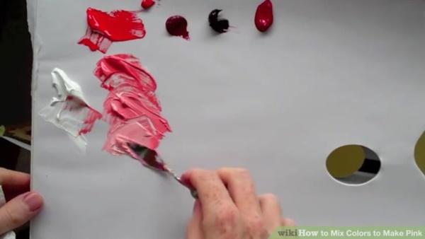
Rose: You get rose when you mix the two primary colors red and white.
Gray: You get gray when you mix the two colors white and black.
Maroon: You get maroon when you mix black and red.
Tertiary colors: When you mix a primary color with a secondary color, you get a tertiary color. For instance, if you want to get brown, you need to mix orange with black. Purple is the color you get when you mix violet with red and so on. The mix of blue and green can result in many different shades of aqua and satin greens depending on the proportions in which you mix them.

Cool and warm hues: The mastery of these mix of colors is very important for you to know when you are trying to use colors. The matching of colors is again a matter of personal choice, but you could do well to know which are the warm hues and the ones that are considered the cool ones. Warm colors include reds, yellows and oranges and cool colors include blues, greens and violets. Black, white and grey are considered more of non-colors or neutral hues.
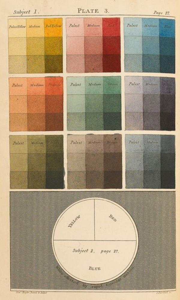
We can go on about the play of colors and how you can mix them but you will realize that the deeper you delve into it, there are more shades and nuances to be had. For instance, the lightest shade of purple or violet is described as lilac. Turquoise is a shade that is a mix of light blue, green and maybe a touch of white to a certain extent. Pistachio green is achieved by mixing white with a secondary color, green, which is a mix of blue and yellow. Creams are derived from whites and yellows and so on.

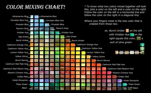
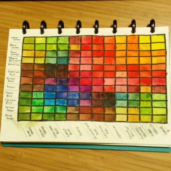
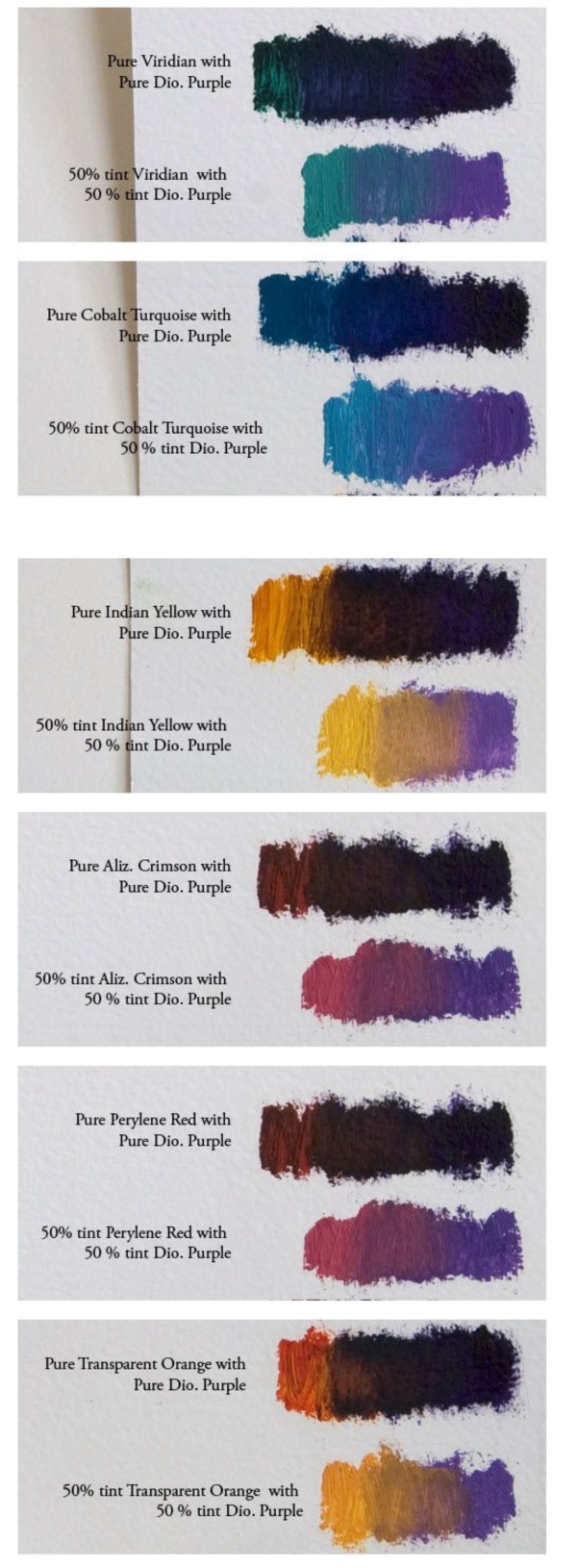
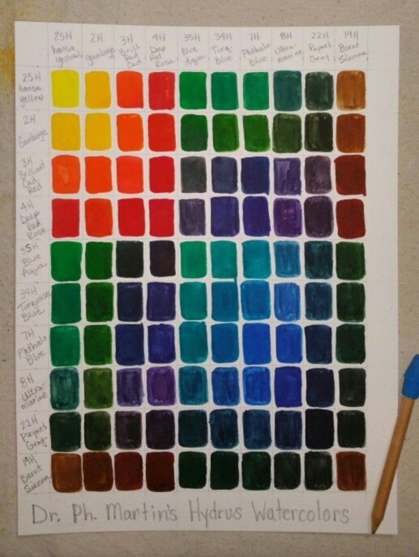
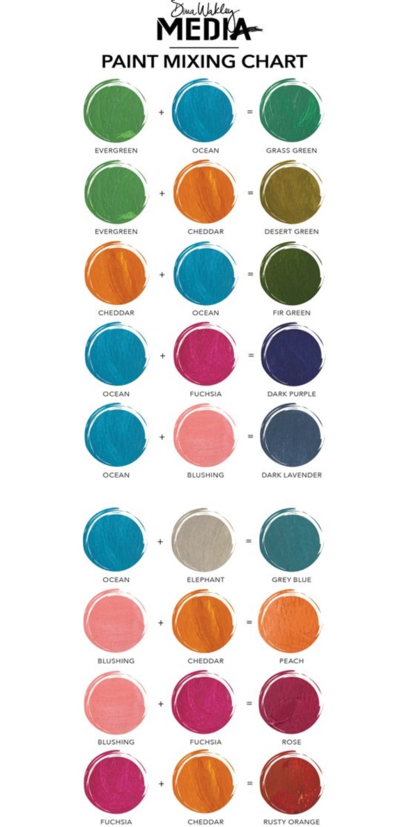
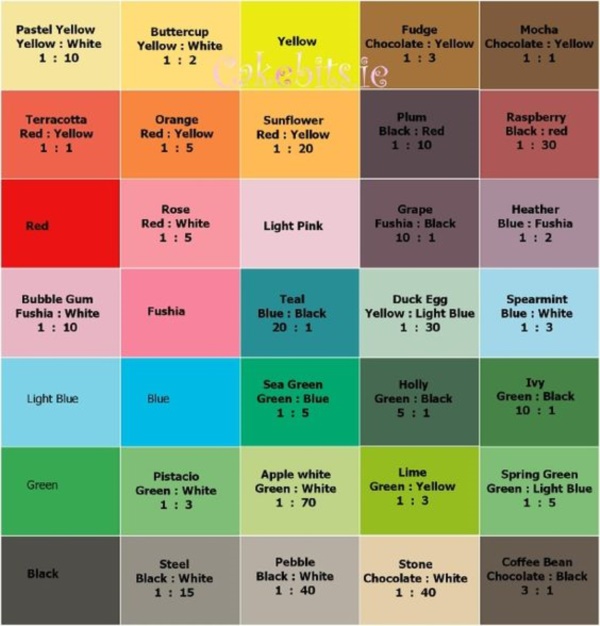
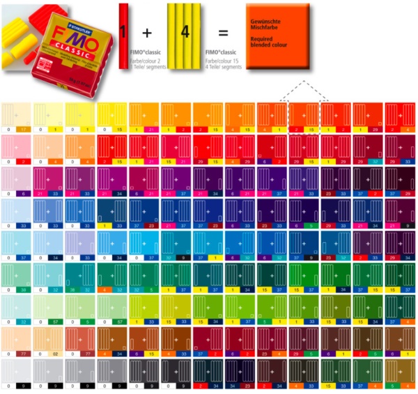
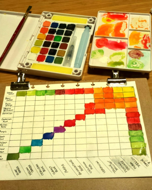
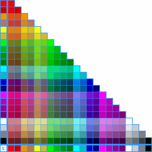
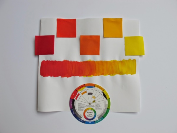
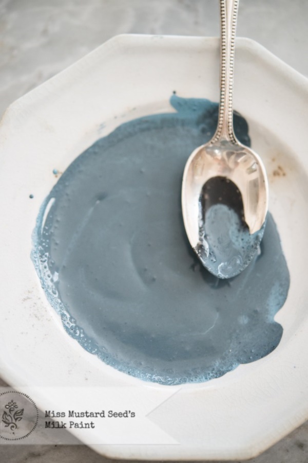
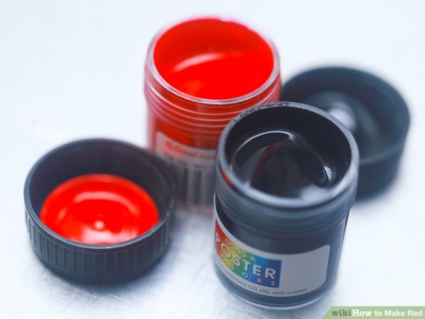
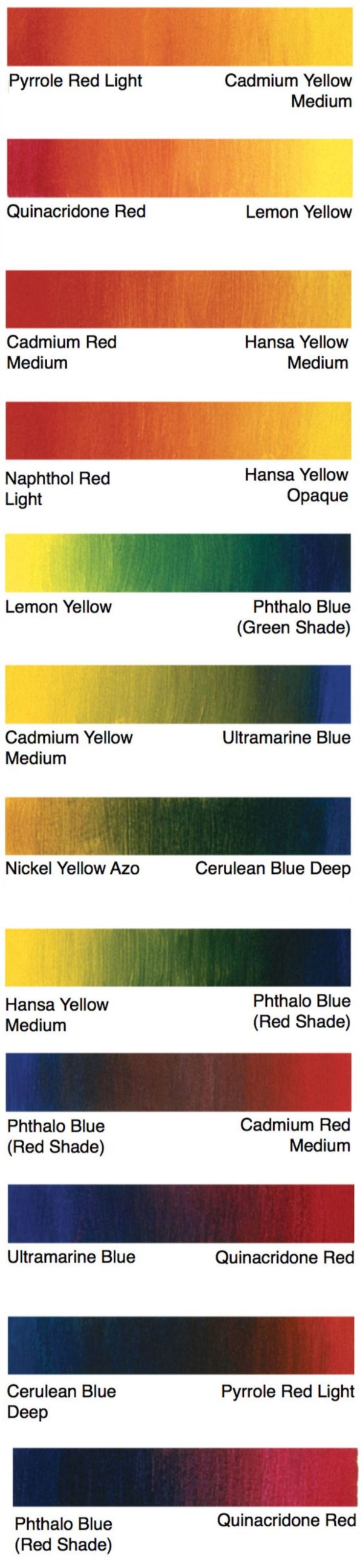
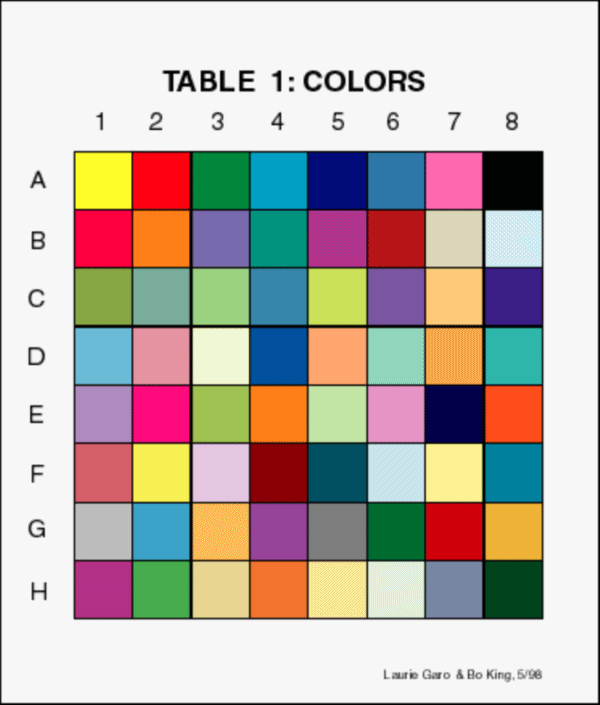
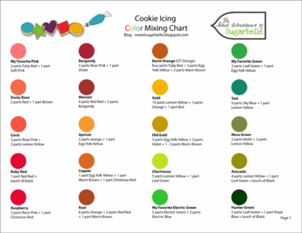
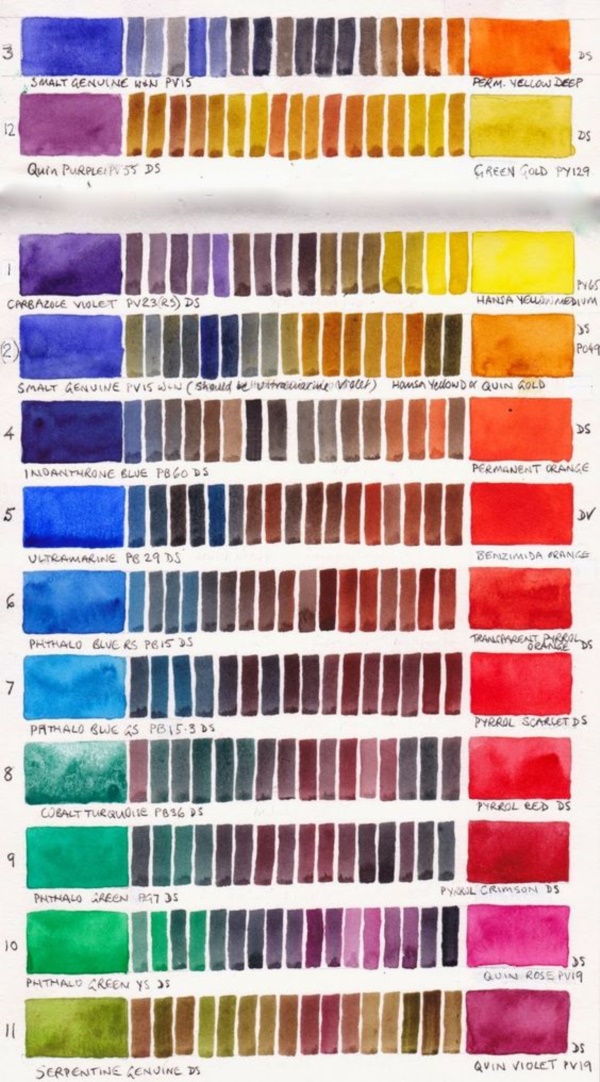
We are sure by now you have looked at the images showing step by step demonstration of the colors mix to learn more about how to go about getting a wide variety of colors and shades.