- 1share
- Facebook0
- Twitter1
- Pinterest0
- Tumblr
Websites are the lifeblood of the Internet, with everyone from your local cycling club to multinational conglomerates to dating ventures such as Loveaholics.com having a strong web presence to allow interaction with all their relevant contacts. But there is so much more to putting together a website to attract traffic than seeding it with keywords and publishing dynamic articles.

There are various design elements which any individual or organization must get right. Failure to do so will result in those all-important visitor figures plummeting. And if no one is coming to look at a website, then it can be regarded as a failure. One of the most crucial design aspects is your color selection. Here’s why.
Importance Of Color Selection In Website Design
The color will create your brand

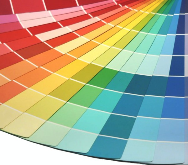
Of course, the beauty of web design is you are free to make amendments at any time, but when it comes to launching a creative website which will catch the eye of potential site visitors, it is far better to establish your brand color from the outset. Just as you get the impression this color scheme truly represents whatever it is you are promoting, so your customers become equally familiar. When they think about your website, the content will be secondary to the overall look in terms of background colors, style, elements, font sizes and so on.
Use colors appropriate to your subject
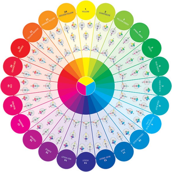
Can you imagine going to a government website for tax return inquiries and being confronted with bright turquoise page backgrounds or purple fonts? How about looking up the homepage of your favorite baseball team and seeing a series of monochrome page layouts? It is critical the colors you choose are appropriate to your subject.
There are no real hard and fast rules beyond this, as much of it is either intuitive or down to personal taste. Common sense is required. If you are promoting ecological products, it would make sense to employ subtle greens. If you are keen to attract the attention of casual Internet browsers, bold headings in red typefaces will do just that. Whatever scheme you choose, it is important to strike a balance between colors which are relevant to your subject matter and those which arrest the attention of anyone who surfs by, regardless of how engaged they might be at the outset.
Consider your target audience

It would be worthwhile putting yourself in the shoes of your customers. How would you feel if you went onto a website where every heading was in orange text, or the articles were in a white font set against a black background? Always have your visitors’ experience foremost. You should do some research online about typical page layouts which are not so user-friendly, especially in light of people who might have a visual impairment. As well as publishing the standard version of your site in all its glory, consider an alternative version for people who aren’t able to differentiate between certain colors.
Coordinate colors
The elements within your website always need to relate to one another. If you choose a particular color, use hues which are variations of it, or colors which blend effectively, such as reds with purples, greens with blues. If your web content includes a lot of images, these should also be treated as logical aspects of the overall look, so the page backgrounds must always be complementing pictures as well as paragraphs of text.
Visiting any website should always be a pleasurable experience for customers. If they are presented with garish typefaces or color schemes which give them headaches, they will certainly not be coming back in a hurry.
Reply