Mandalas are a design that seem to resonate with the universe and are believed to have a mystical value that goes beyond the mere elements of the design. You will notice when you look at a mandala, it seems simple enough but it will draw you in to look at it more often so that you can seek the very personal message it seems to have. That is why it should come as no surprise that coloring them right is important in order to feel a sense of harmony. That is why we feel along with DIY mandala stone patterns to copy, you should also learn how to color them right. Before you confuse them with absolutely beautiful zentangle patterns for many uses, we have to tell you that they may seem similar but are not the same at all.
And while on the topic of coloring mandalas, we feel that you should also look at colors and the impact they have on art so that you have the concept right.
Here are some tips to help you get over the typical struggles you may find yourself going through while trying to pick out colors for your mandalas. First of all, we will tell you about color wheels so that you can make your choices accordingly and then nudge you in the right direction.
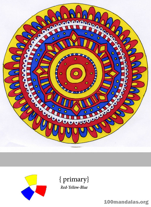
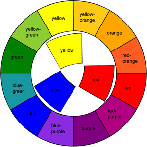
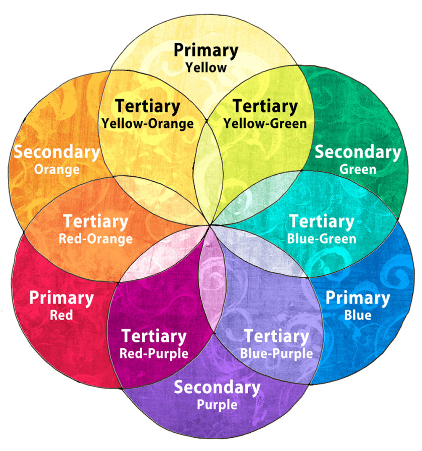
Primary colors: All those colors that are not the result of mixing other colors are considered the primary colors – like yellow, red and blue.
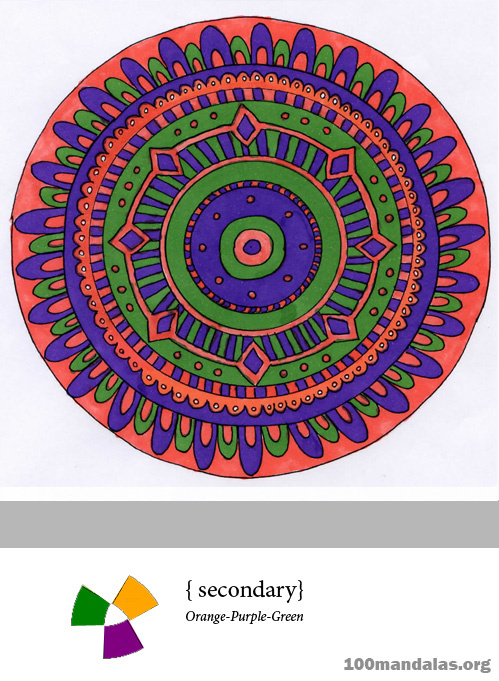
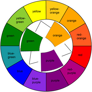
Secondary colors: These are colors that are derived from mixing two of the primary hues and include colors like green, orange, and purple.
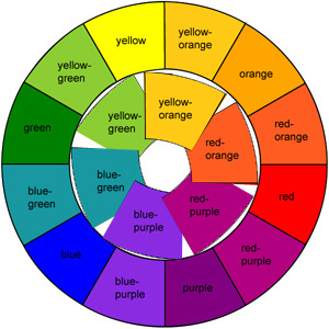
Tertiary colors: These come about when you mix a primary color with a secondary color. Like for instance, when you mix red with purple or orange or so on.
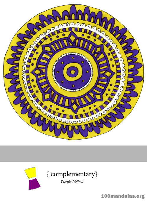
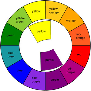
Complementary colors: These are two colors like red and green that are absolutely opposite each other on the color wheel. These colors when combined look really striking. They consist of one primary color with one secondary color.
Now that we have a short introduction of the kind of colors that you can choose from to color your mandalas, we suggest that you follow a particular process for coloring. For instance, if the mandala you are coloring is supposed to make you feel active and spur you into action, then the way to go about it is by going for colors that are diametrically opposite each other on the color wheel. The idea is to energize and not calm or soothe down the person who is looking at the mandala in question.
If the effect you are seeking is the absolute opposite, then go for color combinations that are mild and warm. Like for instance, two colors that are right next to each other. This sort of color combination will tend to bring your mind to a state of calm and have a soothing effect.
Sometimes we color mandalas just for the sake of aesthetics to see how some color combinations work out. For instance, have you ever thought of combining light green, yellow and pink to create a pastel haven? Or going for an all earthy color spectrum like shades of dark and light brown with a touch or two of green thrown in for a bit of relief.
And if you are really feeling adventurous go for a bold mix of more than two primary colors and secondary colors to ensure that your mandala design stands out. This is supposed to be fun exercise and one that does not necessarily follow rules. It is all about going for the colors that appeal to you and making it work.